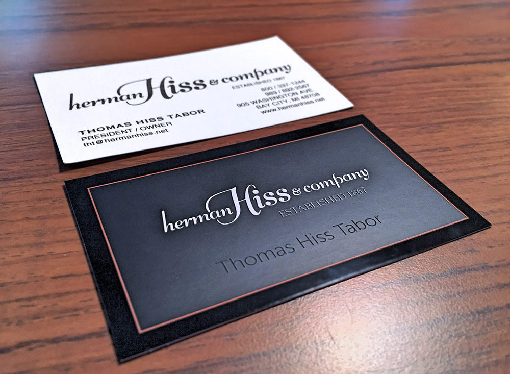
We love the new look that Alan gave to Herman Hiss & Co.’s business cards. Alan’s design – the black version shown at the bottom of the picture – captured the classic style of this family-owned jewelry and gift shop in downtown Bay City. (Tom Tabor’s original card is the white version at the top of the photo.)
Alan moved phone numbers and other details to the back, giving the card a fresh, clean look. It also makes use of all the space on the card, rather than wasting the back.
Changing the little things can make a big difference in the image of your business. If you think it’s time to update your brand, give us a call.

